Redesign Asian Heritage Row website
Im redesigning for Asian Heritage Row
![]()
![]()
![]()
![]()
![]()
![]()
![]()
![]()
A revamp website for Asian Heritage Row, an entertainment and relaxig places for local and foreigners. It has been revamp to suit the night and cultureal life and atmosphere of the places in Asian Heritage Row.


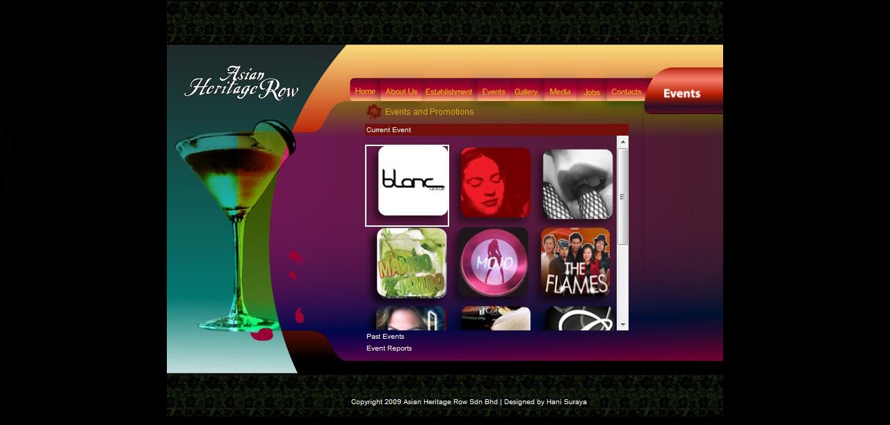


A revamp website for Asian Heritage Row, an entertainment and relaxig places for local and foreigners. It has been revamp to suit the night and cultureal life and atmosphere of the places in Asian Heritage Row.


Comments
2. The overall's site is attractive. 4
3. The site's graphics are pleasing. 4
4. The site has a good balance of graphics versus text. 4
5. The colors used throughout the site are attractive. 5
6. The typography (lettering, headings, titles) is attractive.3
7. The homepage's content makes me want to explore the site further.4
8. It is easy to find my way around the site.4
9. I can get to information quickly. 4
10. It is fun to explore the site.3
11. It is easy to remember where to find things.4
12. Information is layered effectively on different screens.3
13. The hompage is attention-getting. 4
14. Information is easy to read.4
15. Information is written in a style that suits me.4
16. Screens have the right amount of information.4
17. The site effectively communicates the company's identity.4
18. The information is relevant to my professional needs.(not sure lol)
19. The site is designed with me in mind.(eh? what?)
20. The site's content interests me. 4
21. The site's content would keep me coming back.4
22. The site has characteristics that make it especially appealing.5
23. The site reflects progressive, leading edge design. 5
24. The site is exciting.5
25. The site is well-suited to first-time visitors.5
26. The site is well-suited to repeat visitors.5
27. The site has a clear purpose.4
28. I always felt I knew what it was possible to do next. 4
29. It is clear how screen elements (e.g. pop ups, scrolling lists, menu options, etc.) work.5
30. My mistakes were easy to correct.4
1. The homepage is attractive. 5
2. The overall's site is attractive.5
3. The site's graphics are pleasing. 5
4. The site has a good balance of graphics versus text. 4
5. The colors used throughout the site are attractive. 5
6. The typography (lettering, headings, titles) is attractive. 3
7. The homepage's content makes me want to explore the site further. 5
8. It is easy to find my way around the site. 3
9. I can get to information quickly. 5
10. It is fun to explore the site. 5
11. It is easy to remember where to find things. 3
12. Information is layered effectively on different screens. 3
13. The hompage is attention-getting. 5
14. Information is easy to read. 4
15. Information is written in a style that suits me. 5
16. Screens have the right amount of information. 5
17. The site effectively communicates the company's identity. 5
18. The information is relevant to my professional needs. 5
19. The site is designed with me in mind. 5
20. The site's content interests me. 5
21. The site's content would keep me coming back. 4
22. The site has characteristics that make it especially appealing. 5
23. The site reflects progressive, leading edge design. 5
24. The site is exciting. 3
25. The site is well-suited to first-time visitors. 5
26. The site is well-suited to repeat visitors. 4
27. The site has a clear purpose. 5
28. I always felt I knew what it was possible to do next. 5
29. It is clear how screen elements (e.g. pop ups, scrolling lists, menu options, etc.) work. 4
30. My mistakes were easy to correct. 5
Hope that helps, Hun. :3
2. The overall's site is attractive. 4
3. The site's graphics are pleasing. 5
4. The site has a good balance of graphics versus text. 5
5. The colors used throughout the site are attractive. 3
6. The typography (lettering, headings, titles) is attractive. 3
7. The homepage's content makes me want to explore the site further. 3
8. It is easy to find my way around the site. 4
9. I can get to information quickly. 4
10. It is fun to explore the site. 3
11. It is easy to remember where to find things. 4
12. Information is layered effectively on different screens. 3
13. The hompage is attention-getting. 4
14. Information is easy to read. 4
15. Information is written in a style that suits me. 3
16. Screens have the right amount of information. 4
17. The site effectively communicates the company's identity. 3
18. The information is relevant to my professional needs. 3
19. The site is designed with me in mind. 4
20. The site's content interests me. 4
21. The site's content would keep me coming back. 3
22. The site has characteristics that make it especially appealing. 5
23. The site reflects progressive, leading edge design. 4
24. The site is exciting. 3
25. The site is well-suited to first-time visitors. 4
26. The site is well-suited to repeat visitors. 4
27. The site has a clear purpose. 5
28. I always felt I knew what it was possible to do next. 4
29. It is clear how screen elements (e.g. pop ups, scrolling lists, menu options, etc.) work. 4
30. My mistakes were easy to correct. 5
Okay, I don't know how to answer questions #17 and #18, because I don't know what identity the company was going for, and I don't know what you mean by 'professional needs'. =P
As for comments on the actual layout -- I really like the hibiscus designs coming out from the martini glass, it's a very eye-catching design. =) I also like the overall colour scheme.
But I think you're over-doing the gradients. XD I personally think it would be better if the navigation tabs were a solid colour instead of in gradients. It would be easier to read the text, too.
I like that the pictures have rounded corners, though. =D And I like the top and bottom border graphics, too. ^^